Yenny Kim UIUX | Product Designer


Fix It Fast: Taco Bell’s In-App Resolution
Role
Lead UIUX Design (Customer Pod)
User Research
Copy Writing
Date
10/2024 to 03/2025
Project Type
MOBILE APPLICATION
(IOS + Android)
In a world where fast food is just a tap away, one app dares to make things right when orders go wrong. When customers are left empty-handed with no tacos in sight, frustration rises. But now, a smarter, faster solution is here. Introducing Taco Bell’s enhanced in-app resolution experience — a streamlined journey where users can report missing orders with a single tap, track help on the way, and get back to crunch time without calling customer service. This is not just a feature. It’s a mission to restore trust, one resolved order at a time.
Customer's Feedback
During initial user research, we found that many customers appreciate the in-app order issue reporting process for being faster and more straightforward compared to traditional support channels. However, usability testing revealed pain points around the clarity of the reporting flow. Users expressed frustration with having to select missing items individually when they simply wanted to report that their entire order was missing. Additionally, participants highlighted a lack of clear confirmation or follow-up communication after submitting their claim, which affected their confidence that the issue was being resolved. These insights guided our design goals to simplify the reporting flow and enhance communication, ultimately aiming to boost user trust and satisfaction with the in-app resolution experience.

The user must select items individually.
Instead of a refund or connecting
to an agent, a user gets a
free item or a coupon.
Confirmation of help being submitted, but no clear direction of solution.
Contact Us hyperlink takes user to the HELP page on the website.
Straight into Redesign
Since the customer feedback was direct and consistent across multiple sources, we opted to move straight into high-fidelity wireframes for faster iteration. From a UX standpoint, when usability issues are clear, repetitive, and reported by a broad range of users — such as frustration with item-by-item selection and lack of confirmation — additional deep research can create unnecessary delays. Instead, rapid prototyping allows us to validate solutions more efficiently through targeted usability testing. This approach aligns with lean UX principles: act on strong signals, test quickly, and iterate based on user response rather than over-investing in early-stage research when the core pain points are already well defined.


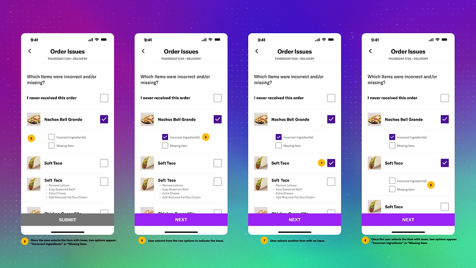

Faster Resolutions with Multi-Select and Calming Confirmation Messages
In the redesigned 2025 in-app resolution experience, users no longer need to individually select and submit each missing or incorrect item. Instead, they can now multi-select all affected items on a single screen, streamlining the process significantly. After selection, users are guided to a dedicated comment screen where they can describe the issue in their own words. Once submitted, the app reassures them with a friendly message: “JUST A MOMENT – We're putting the finishing touches on your experience. Hang tight, and you'll be on your way shortly!”—a deliberate choice to reduce anxiety during wait time without adding friction. Finally, a confirmation screen with the message “HELP IS ON THE WAY” lets users know their case has been received and that support is already in motion—whether through a call, email, or direct contact from the restaurant. This flow was designed to increase clarity, trust, and ease—turning a frustrating situation into a smooth recovery experience.


Entire Order Is Missing!
In addition to further reduce user effort, an option at the top of the screen allows customers to select “I never received this order,” which auto-selects all items from that order. This eliminates the need for users to manually tap each item, speeding up the flow and reducing frustration. After selection, users are taken to a comment screen where they can provide any additional details. Once submitted, the screen displays a calming message — “JUST A MOMENT – We're putting the finishing touches on your experience. Hang tight, and you'll be on your way shortly!” — to reassure users that their claim is being processed. The final confirmation screen lets them know “HELP IS ON THE WAY,” signaling that support is actively addressing their issue. This thoughtful flow is designed to ease anxiety and make resolution feel immediate and human.

